2023
Designing an Icon System for a Multiplatform Application
Company
Shapr3D
Domain
CAD Tool for Design and Manufacturing
Role
Senior Product Designer
Year
2023
Skills
Design System
Native App
iPadOS
macOS
Windows
Figma
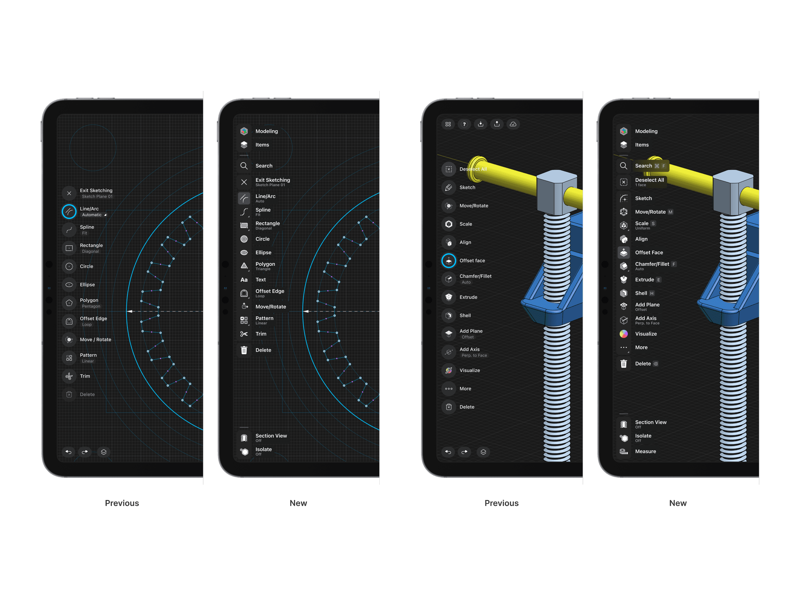
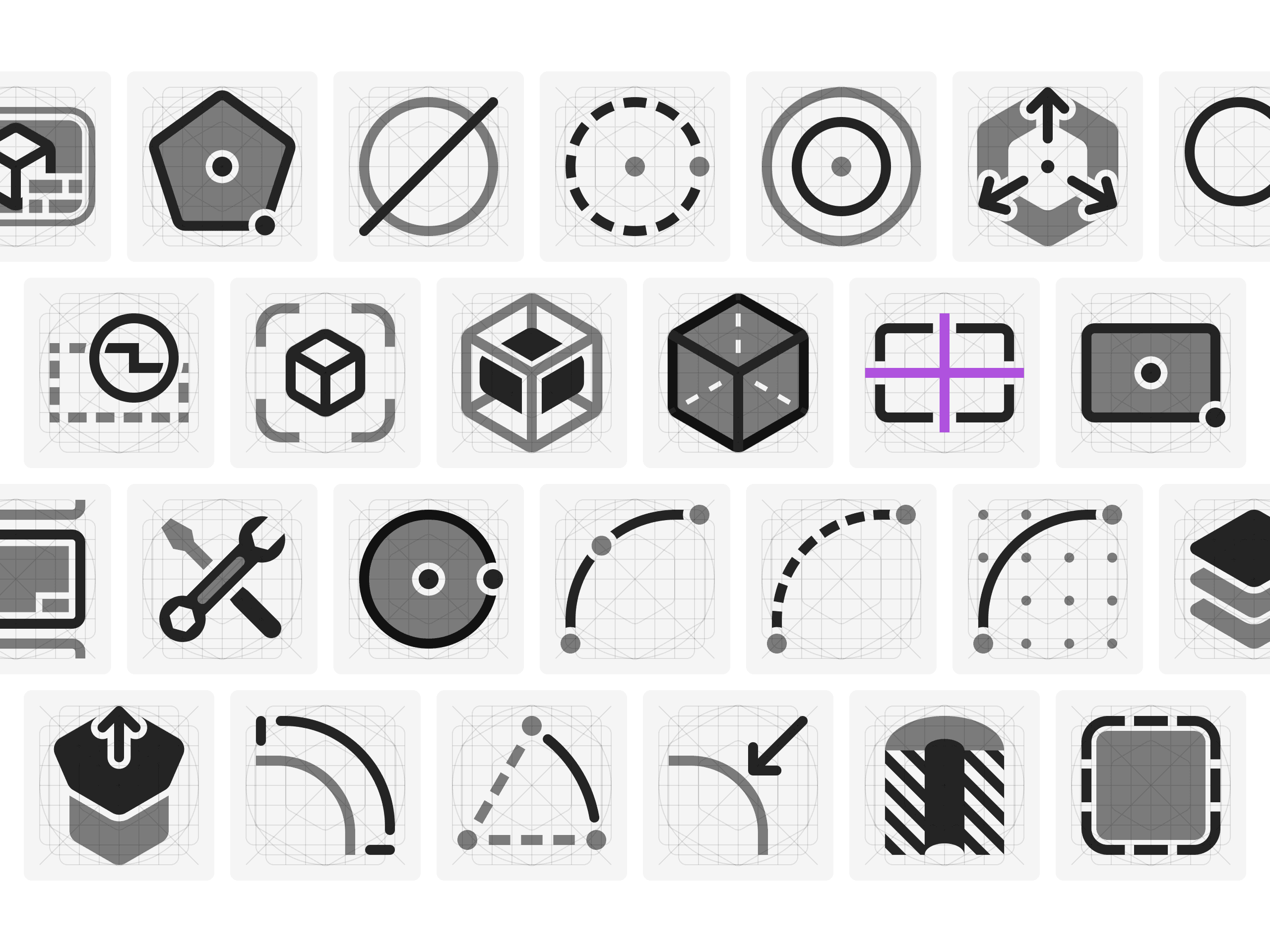
The Problem Space
The primary goal in refreshing the iconography was to create a set that better matches various sizes and platforms. By creating a consistent look, the goals was to make the users feel more in tune with the platforms.
To match comfort with functionality, during the project I've also looked at opportunities to introduce more details and better clarity. The old icons used only a fraction of the available space inside buttons. They had thinner lines, were smaller, and had small details that got lost in some scenarios.
[Image OLD icon grid vs NEW]
The Solution
The way I approached this was by keeping the same icon size and also increasing the size of the shapes and line widths inside to make them more prominent and increase the contrast.

Since the vast majority of the app environment is line-based, the solution shifted away from line-based icons to filled-shape icons. The goal was to removed this conflict with the contrast of filled-shape icons to create visual distinction for a smoother modeling experience.
Additionally, being present of 3 native systems required us to align the icon set to better match each operating system. This icon set plays well with Windows 11 and Apple’s own iPadOS and macOS icon set.